The website for this trendy restaurant had two goals for two audiences:
1) For the consumer - to highlight the intense focus on healthy natural freshness, food quality, and presentation using stylish yet fully user-centered design.
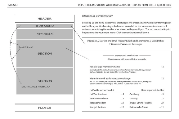
2) For the client - to deliver a truly flexible, easy to use online menu system. Despite the vast amount of plug-in tools for WordPress, there was really nothing to be found both functional and attractive, so a custom solution was developed.
Highlights
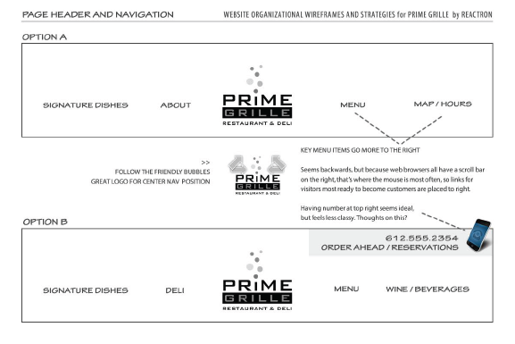
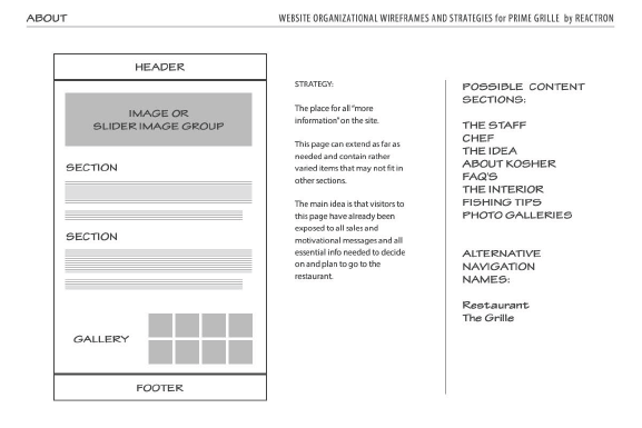
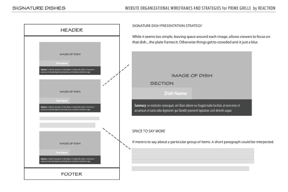
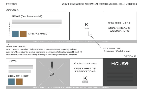
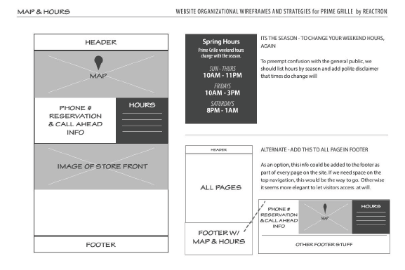
Planning / Wireframes


The website lasted for the entire run of this restaurant until a rebrand into an even more trendy sushi theme.
I'd say the result was "cooked to perfection," but that is way too cliché for my taste.
So, I won't.

